

Table of Contents
- Why Inconsistent Signage Damages Your Dallas Business Brand
- The Cost of Misaligned Signage Across Multiple Locations
- Typography Standards That Strengthen Brand Recognition
- Color Psychology and Consistency in Commercial Signage
- Logo Placement and Scale Requirements for Maximum Impact
- How We Develop Custom Signage Guidelines for Your Brand
- Indoor Signage: Lobby and Interior Branding Standards
- Outdoor Signage: Weather-Resistant Consistency and Durability
- LED Lighting Integration into Your Unified Brand Identity
- Implementation Strategy: From Design to Installation
- Maintaining Brand Standards Across Future Expansions
- Partner With Us to Execute Your Complete Signage Strategy
- Frequently Asked Questions (FAQ)
Why Inconsistent Signage Damages Your Dallas Business Brand
Your signage is often the first physical touchpoint customers have with your business. When signs across your locations, buildings, or departments lack consistency, you’re sending mixed messages about your brand’s professionalism and stability.
Inconsistent signage erodes customer confidence. A customer who sees a polished storefront sign, then visits your lobby and finds outdated or mismatched interior branding, questions whether your business has its act together. This mental friction doesn’t just feel bad—it affects purchasing decisions and loyalty. People naturally gravitate toward brands that appear organized and intentional.
Beyond perception, inconsistent signage wastes your marketing investment. Every sign is real estate you’ve already paid for. When colors, fonts, and logo treatments vary from location to location, you’re diluting brand recall with each installation. Research in branding psychology shows that consistent visual presentation increases brand recognition by up to 80%. In Dallas’s competitive market, where businesses are fighting for attention, every inconsistency is a missed opportunity.
Next step: Audit your current signage across all locations. Take photos of storefronts, lobbies, and wayfinding signs. Note the variations. This baseline will clarify what needs standardizing.
The Cost of Misaligned Signage Across Multiple Locations
Multiple-location businesses face compounded costs when signage standards aren’t documented. Each location becomes a separate design project, often handled by different vendors using different materials and processes. You end up paying for redundant design work, dealing with compatibility issues, and managing inconsistent quality.
Consider a common scenario: a three-location Dallas business owner hands one location to a local shop, another to a different vendor, and manages the third in-house. Six months in, they need updates. Now they’re coordinating with three different vendors, explaining the brand guidelines verbally (which everyone interprets differently), and paying premium rates because there’s no volume purchasing power or standardized process.
The hidden costs multiply quickly:
- Rework and revisions due to unclear specifications
- Premium pricing from vendors who don’t have your template library
- Installation delays while vendors argue over compatibility
- Staff confusion about which version is “correct”
- Customer confusion about whether locations are even part of the same business
We’ve seen clients save 30-40% on their signage spend simply by establishing clear guidelines upfront and centralizing the design and procurement process. One unified standard means one design conversation, bulk material pricing, streamlined installation, and consistent brand presentation.
Actionable step: Calculate your current spend across all locations for the past two years. This number will likely motivate the investment in standardized guidelines.
Typography Standards That Strengthen Brand Recognition
Font choice is one of the most underestimated brand decisions. The typefaces on your signs signal personality, professionalism, and industry positioning. Inconsistent typography undermines all of that in seconds.
Effective signage guidelines specify which fonts to use for headers, body copy, and wayfinding, and under what conditions. For example, you might designate a bold sans-serif for all storefront signs (readable from 30 feet), a clean sans-serif for indoor signage (readable from 10 feet), and a secondary serif font for detailed information (readable up close). This hierarchy isn’t arbitrary—it’s functional.
Dallas businesses often make the mistake of choosing multiple typefaces based on individual preference rather than legibility and brand consistency. A restaurant might use a trendy script font on the exterior (hard to read from a distance) and a completely different sans-serif inside (no visual connection). Customers don’t consciously notice the mismatch, but they feel the brand confusion.
Your guidelines should address:
- Primary font family for all signage (and alternative if the primary isn’t available)
- Secondary font for supporting text or wayfinding
- Minimum font sizes for different sign types and viewing distances
- Font weights (bold, regular, light) and which to use where
- Letter spacing and line height rules for different applications
We recommend limiting your palette to two typeface families maximum. This constraint forces intentional choices and makes every installation immediately recognizable as yours.
Take action now: Pick the two fonts that best represent your brand’s personality, test them at actual viewing distances on mockups, and lock those into your guidelines document.
Color Psychology and Consistency in Commercial Signage
Color is the fastest-read element of any sign. Before a customer reads a single word, they’ve absorbed your color choice, and that color triggers emotional associations. Consistency in color across all touchpoints compounds this psychological effect, building trust and recognition.

Many Dallas business owners choose colors reactively: “This shade of blue looks good right now.” Professional branding requires intentional color selection based on your industry, target audience, and psychological goals. A healthcare provider benefits from calming blues and greens. A retail brand might use bold, energetic colors. A law firm typically uses sophisticated navy, charcoal, or forest green.
Your color guidelines must specify:
- Primary brand color (with exact hex, RGB, and CMYK values for print)
- Secondary colors (and how to combine them without visual clash)
- Accent colors for specific applications
- Acceptable contrast ratios for readability on different backgrounds
- When to use full color, spot color, or monochrome versions
Material matters too. The color you see on your designer’s screen won’t match the color on a vinyl wrap or LED display without precise color specification. We use manufacturer color systems and physical samples to ensure what we produce matches your intent exactly.
Consistency across materials compounds your brand investment. When your customers see the same color appearing on your storefront, your lobby sign, your vehicle wrap, and your social media, the brand becomes unmistakable. That repetition creates neural pathways that make your business memorable.
Next move: Identify your primary brand color by hex code. Check it across different lighting conditions (daylight, evening, fluorescent). Verify it has enough contrast against your chosen backgrounds.
Logo Placement and Scale Requirements for Maximum Impact
Logo placement and sizing rules separate amateur from professional signage. A logo too small gets lost. A logo too large overwhelms the message. Logos placed haphazardly create visual confusion.
We develop placement rules based on viewing distance and sign type. A storefront sign viewed from 50 feet away needs a much larger logo than an indoor wayfinding sign viewed from 8 feet. Your guidelines specify minimum and maximum logo sizes for each application, and margins around the logo that must be preserved.
Common placement standards across Dallas businesses we work with include:
- Storefront signs: logo as a primary visual element, 25-50% of sign real estate
- Lobby signs: logo centered or left-aligned depending on layout, balanced with text
- Business cards and small collateral: logo to scale appropriately with text
- Vehicle wraps: logo visible from multiple angles and distances
Scale rules prevent embarrassing outcomes. We’ve seen logos shrunk so small they’re illegible, and logos enlarged so much the letter forms distort or the file quality degrades. Your guidelines should specify approved logo files for different applications (print-ready vector for signs, web-optimized versions for digital).
Protection zones around logos are equally important. This is the minimum clear space around your logo where no other design elements can intrude. It preserves legibility and prevents awkward visual crowding.
Action item: Create two versions of your logo file: one high-resolution for printing large (storefront signs), and one web-optimized for digital. Document the minimum size below which your logo becomes unreadable.
How We Develop Custom Signage Guidelines for Your Brand
Creating effective signage guidelines requires collaboration between your brand perspective and our technical expertise. We don’t hand you a generic template. We work with you to translate your brand identity into actionable, measurable specifications.
Our process starts with a discovery conversation. We ask: What does your brand promise? Who are your customers? What feeling should they have when they interact with your signage? How many locations do you currently have, and where do you plan to expand? What materials have worked well in your past, and what hasn’t?
From that foundation, we develop a custom guidelines document that includes:
- Brand story and positioning (one paragraph that clarifies your focus)
- Logo specifications with clear, approved files
- Typography standards with legibility distance guidelines
- Color palette with hex codes and material-specific samples
- Layout templates for common sign types
- Material recommendations based on location and durability needs
- Installation standards to ensure consistent appearance
We then create mockups of your signage applied to actual sign types and materials in real lighting. This prevents surprises. You see exactly what your brand looks like before any fabrication happens.
This investment up front saves confusion, rework, and cost down the line. When your team or future vendors need to know how to represent your brand, they have one clear reference.
Next step: Schedule a discovery call with us. We’ll discuss your brand, your locations, and your expansion plans. No obligation, and you’ll walk away with clarity on what unified signage can do for your business.
Indoor Signage: Lobby and Interior Branding Standards
Indoor signage requires different design considerations than outdoor signs. Lighting is controlled, viewing distances are shorter, and the environment is more intimate. Your lobby sign and interior wayfinding set the tone for the customer experience.
Acrylic lobby signs are a Dallas standard for good reason: they project professionalism, they accept precise lettering, and they complement modern and traditional spaces. But the impact depends on consistent design execution across all indoor touchpoints.
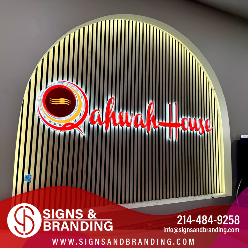
Your indoor standards should address:
- Lobby sign dimensions and positioning (centered above reception desk, or left-aligned by the entrance)
- Interior wayfinding hierarchy (main departments, then sub-departments, then room numbers)
- Material consistency (all acrylic, or a specific combination of materials)
- Lighting approach (backlit, front-lit, or natural lighting)
- Font size relative to viewing distance and audience (customers versus staff)
Many Dallas businesses make the mistake of treating indoor signage as secondary. But customers form lasting impressions in your lobby. Sloppy or mismatched interior signage suggests disorganization, even if your storefront is pristine.
We typically recommend one unified material system for all indoor signs. This creates visual coherence and simplifies future additions or updates.
Practical action: Walk through your lobby and interior spaces. Note every sign (office names, restroom signs, directional arrows, department names). Photograph inconsistencies. This audit informs your indoor standards.
Outdoor Signage: Weather-Resistant Consistency and Durability
Dallas weather is harsh on signs. Summer heat, sporadic heavy rain, and intense UV exposure degrade materials and finishes quickly. Your unified branding standards must account for durability, or you’ll face fading, peeling, and deterioration that damages your brand image.
Custom outdoor signs need to be engineered for longevity. This means material selection matters as much as design. We use weather-resistant materials rated for Texas climate conditions, and we apply protective coatings that preserve color and finish for years.
Your outdoor signage guidelines should specify:
- Approved materials for different sign types (aluminum composite, vinyl, acrylic, metal)
- Protective coatings (UV-resistant clear coats, weather-resistant vinyl)
- Maintenance schedule (annual cleaning, resealing every 3-5 years)
- Expected lifespan and replacement cycle
- How colors will be specified to account for weathering
Consistency in outdoor signage is particularly important because weather affects all signs equally. If one location’s sign fades noticeably while another stays vibrant, customers notice the difference and question maintenance standards.
We back our work with a 5-year quality warranty. This gives you confidence that your outdoor signage will maintain its appearance and function as intended. All materials are tested for durability before we recommend them.
Immediate step: Evaluate your current outdoor signs. Are they fading? Peeling? Damaged? Document condition. This tells you whether your current material choices are appropriate for Dallas.
LED Lighting Integration into Your Unified Brand Identity
LED lighting has transformed commercial signage. Modern LEDs are energy-efficient, long-lasting, and dramatically improve nighttime visibility and brand presence. But haphazard LED integration creates visual chaos.
Your unified branding standards should specify how lighting enhances your brand:
- Which signs should be illuminated (storefront? entire exterior? interior accents?)
- Color temperature (warm white for hospitality, neutral white for healthcare, cool white for tech)
- Brightness levels appropriate to your brand personality
- Whether to use solid illumination, color-changing, or animated effects
- Maintenance and warranty expectations
Many businesses add LEDs as an afterthought, choosing whatever’s cheapest or most readily available. This creates inconsistency: your storefront sign glows warm white, but your lobby sign flickers cool white, and your secondary location has no lighting at all. The brand experience fragments.
We offer commercial LEDs at wholesale pricing, which means you get quality lighting without premium retail markups. More importantly, we integrate LED lighting into your overall signage strategy, ensuring it reinforces your brand rather than contradicting it.
Consider a unified approach: all external signs backlit with consistent warm white LEDs, all interior signage lit to match ambient lighting. This creates a cohesive, intentional appearance.
Action to take: Decide which signs need illumination for visibility and brand impact. Test LED color temperatures on mockups to see what feels right for your brand.
Implementation Strategy: From Design to Installation
Unified branding only works if execution is precise. Our implementation process ensures your signage guidelines translate accurately from concept to installed reality.
We start with detailed design mockups. You review them in context, we refine, and you approve before any fabrication. This prevents expensive rework and ensures the final product matches your expectations.
Fabrication is in-house, which gives us control over quality and consistency. We follow your guidelines exactly, using approved materials and specifications. Our 2-3 week turnaround means your signage is ready quickly, and our licensed, insured installation team ensures proper placement and professional appearance.
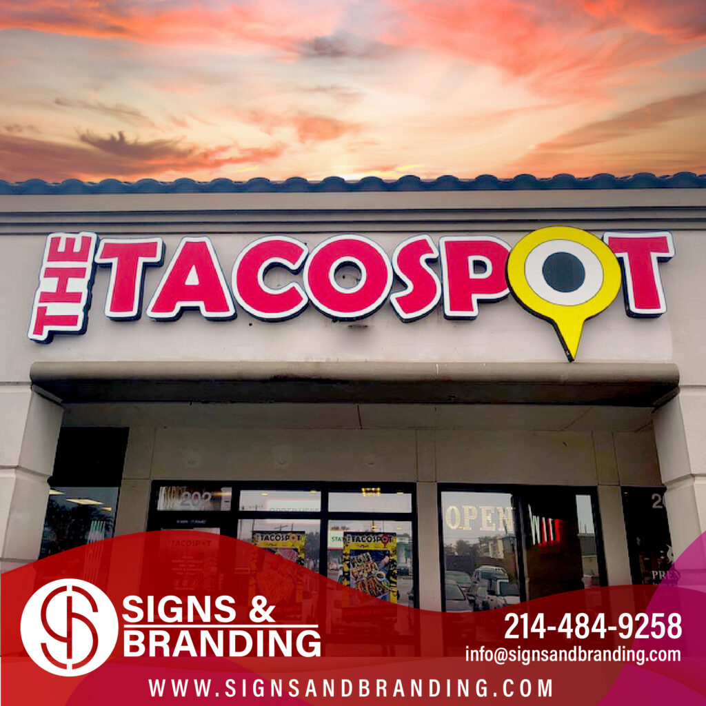
The implementation timeline typically looks like:
- Week 1: Discovery, guidelines development, and initial design concepts
- Week 2: Mockup refinement and approval
- Week 3-4: Fabrication and preparation
- Week 5: Installation with quality verification
For multiple-location rollouts, we sequence installations strategically. We might start with your flagship location, then use that as proof of concept for other locations. This builds confidence and ensures consistency.
Documentation is critical. We provide your team with installation photos, maintenance guides, and updated guidelines reflecting any field adjustments. Future vendors have clear specifications to follow.
What to do next: Gather your team and review your current signage specifications (or lack thereof). Identify the biggest inconsistencies or problem areas. Prioritize which locations need updates first.
Maintaining Brand Standards Across Future Expansions
Businesses grow. New locations, new departments, new services. Without clear guidelines, each expansion becomes an opportunity for brand drift.
Your documented guidelines serve as a template for growth. When you open a second location, your design team references the guidelines and produces signage that matches the first location exactly. When you hire new staff or work with new vendors, they have a clear reference for how to represent your brand.
We recommend annual brand reviews. Every year, assess whether your signage remains consistent across all locations, whether materials are holding up, and whether any updates are needed. This prevents slow drift and keeps your brand presentation sharp.
Some brands evolve intentionally. A business that started in 2015 might update its brand identity in 2026. When that happens, clear guidelines make refresh cycles manageable. You update the guidelines document, and all future signage follows the new standard. Existing signage gets updated on a planned schedule rather than haphazardly.
Growth without guidelines is chaos. Growth with clear standards is scalable success.
Action item: Create a three-year expansion plan. Identify which locations need new signage, which need refreshes, and what new locations might need. This informs your guidelines and budget.
Partner With Us to Execute Your Complete Signage Strategy
Unified signage branding isn’t luxury—it’s a practical investment in how customers perceive your business. When every sign reflects consistent design, professional quality, and intentional brand positioning, customers trust you more, remember you better, and choose you again.
We handle the full process: discovery, guideline development, design, fabrication, and installation. We work in-house, so we control every detail. We honor timelines, we deliver quality, and we back our work with a 5-year warranty. Our commercial LED expertise and wholesale pricing add real value to your project.
Getting started is simple. Contact us to discuss your current signage, your brand goals, and your locations. We’ll assess what unified branding can do for your business and provide a clear roadmap.
Your Dallas business deserves signage that represents you professionally and consistently. Let’s build that together.
Contact us today for a FREE Estimate
Frequently Asked Questions (FAQ)
How do we ensure our signage designs meet your brand guidelines across multiple locations?
We start by developing a custom signage standards document specific to your brand, covering typography, color specifications, logo placement, and sizing requirements. Our in-house design team then applies these guidelines to every sign we create for you, whether it’s your first location or your tenth. We review each design against your standards before fabrication to catch any inconsistencies early, so your customers see the same professional brand experience everywhere.
What makes your signs weather-resistant for Dallas’s outdoor conditions?
We fabricate all outdoor signage using materials specifically chosen to withstand Dallas heat, UV exposure, and occasional severe weather. Our weather-resistant coatings and construction methods protect against fading, rust, and deterioration, which is why we back our work with a 5-year quality warranty. You can trust that your storefront branding will maintain its visual impact and consistency year after year without requiring constant maintenance or replacement.
Can you handle LED integration into our existing brand signage system?
Yes, we source commercial LEDs at wholesale pricing and integrate them into your unified branding strategy, whether that’s backlighting your logo, illuminating interior wayfinding, or creating exterior accent lighting. Our team designs the LED placement and color temperature to complement your brand guidelines and enhance visibility without compromising your visual standards. We handle both the fabrication and licensed installation, so your entire project stays coordinated from concept to completion.